Kraft Candle Boxes with Dust Covers: How to Match Printing Across the Box and Cover
A kraft candle box and matching dust cover may use the same branding but still print differently. Learn how to coordinate kraft shades, ink colors, logos, fragrance artwork, finishes and proofs so both pieces look like one packaging system.
 Published June 12, 2026
Updated September 04, 2026
14 min read
Published June 12, 2026
Updated September 04, 2026
14 min read
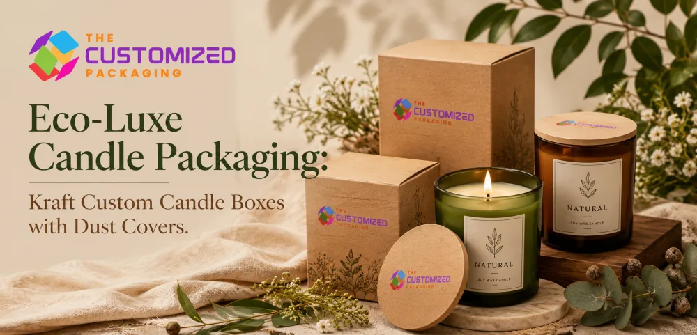
Kraft candle boxes with dust covers can create a coordinated presentation from the outside of the package to the top of the candle jar. But using kraft for both pieces does not automatically mean they will look identical.
The outer box and inner dust cover may use different paper weights, surfaces and manufacturing processes. The same black ink, white logo or fragrance color can therefore appear slightly different on each component.
For candle brands developing custom candle boxes, the goal should be to design the kraft box and dust cover as a visual pair while respecting the differences between the two materials.
That means planning the kraft shade, artwork, logo treatment, fragrance identification, ink coverage and finishing before approving either component separately.
Start With the Kraft Appearance You Actually Want
“Kraft” does not describe one exact color.
Natural kraft stocks can vary in tone and texture. One may appear light and relatively smooth, while another can have a deeper brown appearance with more visible paper fibers.
This matters when kraft candle boxes with dust covers are intended to look closely matched.
If the outer carton and dust cover come from different stocks, compare physical samples rather than assuming that both materials labeled “kraft” will have the same appearance.
Check:
-
Kraft shade
-
Surface texture
-
Fiber visibility
-
Print smoothness
-
Material weight
-
Overall visual consistency
A slight difference may be acceptable when it looks deliberate. A large difference can make the dust cover appear as though it came from a different packaging project.
Decide Whether the Box and Cover Should Match or Contrast
Matching is only one design direction.
The outer kraft box and dust cover can also be intentionally different.
For example, a candle brand might use a natural kraft outer carton with a white dust cover. Another collection might use a kraft carton with a black printed cover. A cream or colored cover can also create a stronger reveal when the box is opened.
The important question is whether the contrast is intentional.
If both components are supposed to look like the same natural kraft material, close stock coordination becomes important.
If the dust cover is deliberately different, use that contrast as part of the design rather than trying to hide it.
Understand How Ink Appears on Kraft
Kraft is not a neutral white printing surface.
The brown material becomes part of the final color.
This is particularly noticeable with lighter inks and softer candle color palettes.
Pastels, pale neutrals and light botanical colors may appear warmer or more muted when printed directly onto natural kraft.
Darker artwork generally creates stronger visual contrast.
Black is particularly useful for restrained kraft designs because logos, fragrance names and line illustrations can remain clear without covering the natural paper appearance.
Before final production, compare printed artwork on the actual stock rather than approving colors only from a computer screen.
White Ink Can Create a Different Design Direction
White ink gives brands another option for custom kraft boxes.
It can be used as the visible artwork itself or beneath selected colors.
A white logo on natural kraft creates a different effect from black printing. White typography can also make fragrance names or collection details stand out while allowing most of the kraft surface to remain visible.
White can also serve as a base beneath another printed color when more separation from the brown substrate is needed.
However, the box and dust cover should both be tested.
Different kraft surfaces may absorb or display white ink differently, which can affect how closely the two components match.
Do Not Assume the Same Artwork Will Print the Same on Both Pieces
The outer box and the dust cover perform different physical jobs.
The carton may use heavier folding board, while the dust cover can use a lighter paperboard or cardstock.
Even when both have a kraft appearance, differences in surface smoothness and paper construction can affect the result.
A logo printed at the same color specification may look slightly darker on one piece.
Fine lines may reproduce differently.
A large solid area may appear more even on one material than the other.
That is why the two components should be evaluated as one packaging project while still being proofed individually.
Keep the Main Brand Identity Consistent
Although the components do not need identical artwork, the customer should recognize that they belong together.
Keep core identity elements consistent.
These may include:
-
Logo
-
Typeface
-
Fragrance naming system
-
Collection name
-
Main accent colors
-
Illustration style
-
Brand symbols
Consistency does not require duplication.
The outside of the box may contain the complete product hierarchy, while the candle dust covers use only the logo, fragrance name and one visual element from the outer artwork.
That creates continuity without making the dust cover look like a reduced copy of the front panel.
Decide What Belongs on the Outer Box
The outer kraft carton normally has more usable print area.
It can carry the main information customers need when identifying the candle.
Depending on the product and applicable labeling requirements, this may include the brand name, candle name, fragrance, net quantity, company information, barcode and other required or useful product information.
The outer box should therefore establish the primary visual hierarchy.
A customer looking at the package should quickly understand:
Who made it → what candle it is → which fragrance it contains
The artwork can then move supporting details to the side and back panels.
Give the Dust Cover a Simpler Role
The dust cover has much less room.
Instead of filling it with everything already printed outside, use it for a focused interior message.
Useful options can include:
-
Logo
-
Fragrance name
-
Collection name
-
Short candle-care reminder
-
Small QR code
-
Brief message
-
Simple illustration
A dust cover should remain easy to read from above.
The smaller circular or shaped format usually benefits from fewer elements and more open space.
For detailed guidance about the physical diameter, wick openings and removal features, the candle dust cover sizing guide should be used separately. This keeps artwork decisions and fit decisions clear instead of forcing both subjects into one design step.
Coordinate Logo Scale Between the Two Components
Using the same logo file does not mean it needs to be printed at the same physical size.
A logo that works across the front of a candle box may dominate a small dust cover.
Reduce it according to the available area while preserving enough size for fine details and text to reproduce properly.
The box can use a larger primary brand mark.
The dust cover might use a simplified mark, icon or smaller logo.
If the brand has both a full wordmark and a compact symbol, the two surfaces can use them strategically.
Build Fragrance Recognition Into Both Pieces
Fragrance identification is especially useful when one candle collection contains many similar jars.
The outer box should clearly identify the scent.
The dust cover can repeat the fragrance name or a recognizable color or symbol so the candle remains identifiable after the outer carton is removed.
For example, one kraft packaging system might keep the same box structure and logo while assigning each fragrance its own accent.
Lavender might use one accent.
Vanilla might use another.
Cedar or oud might use a deeper contrasting treatment.
The exact colors should follow the brand's own identity rather than a generic formula.
What matters is maintaining the same coding system on both the box and cover.
Plan One System for Multiple Candle Scents
A coordinated packaging system can become particularly useful for brands selling several fragrances in the same jar size.
Instead of redesigning the entire package for every scent, the structural layout can stay consistent while selected artwork changes.
The constant elements might include:
-
Kraft stock
-
Logo position
-
Typography
-
Information hierarchy
-
Dust-cover layout
The variable elements might include:
-
Fragrance name
-
Accent color
-
Illustration
-
Collection symbol
-
SKU information
This makes the range easier to manage while still allowing each candle to have its own identity.
Avoid Color Differences That Look Accidental
A slight difference between two kraft materials can be acceptable.
The bigger issue is when a brand color appears intentionally strong on the box but weak or muddy on the dust cover.
This can happen when the materials behave differently under the same artwork.
For critical brand colors, compare printed samples side by side.
Do not evaluate the outer box one week and approve the dust cover later without comparing them.
Place both components together with the candle jar.
The customer will experience them together, so they should be approved together.
Use Metallic Finishes Carefully
Foil stamping can create a strong contrast against kraft.
A small gold, silver, copper or other metallic brand element may work well on the outer carton or dust cover when it suits the brand.
But applying the same foil treatment to both pieces requires practical testing.
The dust-cover material may be thinner than the outer carton. Fine foil details can also behave differently on textured paper.
The goal should be visual coordination rather than forcing every finish onto every component.
For example, the outer box can carry a foil logo while the dust cover uses a simpler one-color version of the same mark.
The relationship is still clear.
Embossing and Debossing Do Not Need to Be Repeated Everywhere
Texture can add another layer to kraft packaging, but it should have a purpose.
An embossed or debossed logo may work well on the outer carton where there is enough material strength and surface area.
The dust cover does not necessarily need the same treatment.
A printed mark may be more appropriate depending on its stock and position over the candle.
Use finishing selectively so the package feels coordinated rather than overworked.
Keep Fine Typography Readable
Small text can be difficult to reproduce on a visibly fibrous kraft surface.
This is especially important for fragrance descriptions, small brand marks or detailed care messages.
Avoid relying on extremely thin strokes or low-contrast colors.
The dust cover deserves particular attention because it often uses smaller typography than the outer carton.
Check printed samples at actual size.
If the text requires magnification to read comfortably, it is probably too small or too delicate for the selected material.
Think About the Customer's Viewing Sequence
The outer box is usually seen first.
The dust cover is revealed later.
Artwork can use that sequence intentionally.
The outer box can introduce the candle and fragrance.
The dust cover can continue the same visual language with a simpler message.
That might mean the customer sees the full fragrance identity outside, then a small version of the scent artwork after opening the carton.
The two surfaces should feel related without saying exactly the same thing.
Use QR Codes Where They Add Value
A QR code can connect packaging to additional candle information without filling every printed surface with text.
It could lead to:
-
Candle-care instructions
-
Fragrance information
-
Product details
-
The complete collection
-
Brand information
Choose the surface according to how customers are expected to use it.
An outer-box QR code can be scanned before the product is opened.
A dust-cover QR code becomes visible after opening.
Whichever location is chosen, test the printed code from the actual production sample.
Do not assume a small QR code will remain reliable merely because it works in the digital artwork.
Keep Structural Topics Separate From Artwork Topics
The printing system should be planned around the final candle package, but the artwork does not replace structural engineering.
A dust cover does not secure a heavy glass candle inside an oversized carton.
An outer box does not determine the dust-cover diameter.
If a jar needs positioning inside the carton, candle boxes with inserts should be evaluated for that purpose.
If the project uses a glass or ceramic vessel, the custom jar candle boxes guidance can help with the broader packaging structure.
Keeping these functions separate prevents decorative decisions from being mistaken for protection decisions.
Proof the Box and Dust Cover as a Pair
This is one of the most important steps in the process.
Do not approve the outer kraft candle box without seeing how its artwork compares with the dust cover.
A physical proof can reveal differences that are difficult to judge digitally.
Compare:
-
Kraft shade
-
Black ink density
-
White ink appearance
-
Brand-color reproduction
-
Logo scale
-
Typography
-
Fragrance coding
-
Foil appearance
-
Surface texture
-
Overall visual balance
Place the finished candle inside the package and look at the complete sequence from closed box to open box.
That is the experience the customer will see.
Check Every Fragrance Before a Larger Run
If the same kraft candle boxes with dust covers are being used across several fragrances, review the complete artwork set before production.
Make sure each outer box is paired with the correct dust-cover version.
Check that fragrance names match.
Check accent colors.
Check collection identifiers.
Check SKU information where used.
This is especially important when most of the artwork remains the same and only a few details change.
Small versioning mistakes are easier to miss when designs look nearly identical.
Prepare Better Information When Requesting a Quote
Providing clear project information helps the packaging team evaluate the job more accurately.
For a kraft candle box and matching printed dust cover, useful details include:
-
Candle jar dimensions
-
Box style
-
Desired kraft appearance
-
Dust-cover size if already established
-
Printing colors
-
Logo artwork
-
Fragrance variants
-
Special finishes
-
Quantity
-
Delivery requirements
If the dust-cover dimensions have not yet been finalized, provide the actual vessel measurements or a physical sample so fit can be evaluated separately.
Clear specifications make it easier to quote the complete packaging system rather than pricing unrelated components.
Frequently Asked Questions
Can the candle box and dust cover use the same kraft material?
They can use materials with a similar kraft appearance, but the required thickness and construction may differ. Compare physical samples when close visual matching is important.
Will the same ink color look identical on the box and dust cover?
Not always. Differences in kraft shade, surface and material construction can affect the printed result. Printed proofs are useful when color consistency matters.
Can white ink be printed on kraft candle packaging?
White printing can be used on suitable kraft stocks and can create strong contrast or support selected artwork. The actual result should be tested on the intended material.
Should the same logo appear on both pieces?
It can, but the logo may need a different scale or simplified treatment on the smaller dust cover.
Can different fragrances use the same kraft box design?
Yes. When the candle vessels share the same packaging dimensions, the core structure and design system can remain consistent while fragrance names, colors or other identifiers change between SKUs.
Do candle dust covers replace inserts?
No. Dust covers sit above the wax and serve a different purpose. Inserts are used when the candle jar needs positioning or support inside the outer package.
Does kraft automatically make candle packaging recyclable or sustainable?
No. Environmental characteristics depend on the complete packaging construction and supporting material information.
Create Kraft Candle Boxes and Dust Covers That Look Like One Packaging System
Kraft candle boxes with dust covers work best when the two components are designed together but not treated as identical surfaces.
The outer carton provides the larger branding and information area. The dust cover creates a smaller interior touchpoint. Kraft shade, ink behavior, logo scale, fragrance coding and finishing should connect the two without forcing the exact same artwork onto both.
The Customized Packaging can produce custom printed candle boxes and matching candle dust covers around your candle jar, branding and collection requirements.
Share your jar dimensions, preferred box style, kraft appearance, artwork, fragrance variations, printing requirements and quantity to request a custom quote.