
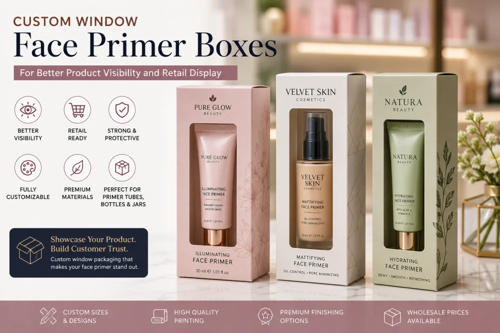
Custom Window Face Primer Boxes: How to Position the Window Around Tubes, Pumps and Jars
A window only helps face primer packaging when it reveals the right part of the product. Learn how tube height, pump position, jar shape, labels, internal supports and shelf viewing angles determine the best window size and location.
 Published June 02, 2026
Updated September 03, 2026
17 min read
Published June 02, 2026
Updated September 03, 2026
17 min read
A window can make face primer packaging more useful at retail, but only when it shows the right part of the product.
A perfectly centered opening on the box does not always create a perfectly centered product view.
A squeeze tube may sit higher because of its cap. A pump bottle may have a narrow body and tall dispenser. A jar may sit low inside a fitted base. An internal support can move the primer several millimeters away from where the artwork originally expected it to be.
That is why custom window face primer boxes should be designed around the actual primer container inside the finished carton.
The first decision is not the shape of the window.
It is what the customer should be able to see through it.
Decide What the Window Needs to Show
Different primer containers have different features worth revealing.
For one product, the useful view may be the bottle itself.
For another, it may be:
-
Primer label
-
Container color
-
Decorative cap
-
Pump
-
Tube artwork
-
Product shade
-
Frosted bottle finish
-
Jar shape
Choose one primary purpose.
If the window is supposed to show the primer label, position it around the label.
If the container design is the main feature, give the customer enough view to understand the shape.
A window should reveal something useful instead of simply creating another cutout in the carton.
Start With the Actual Primer Container
Before positioning the window, measure the complete packaged product.
That includes the:
-
Container body
-
Cap
-
Pump
-
Tube shoulder
-
Sealed tube end
-
Jar lid
-
Label
-
Decorative sleeve
-
Insert or internal support
Then place the product in its intended position inside the box.
This is important because the product's location inside the carton determines what customers will actually see.
Do not design the opening around an isolated bottle image and then add the internal support later.
Product Position Comes Before Window Position
The correct order is:
primer container → internal position → support or insert → window location
not:
window → product forced behind it
If a fitted insert raises the bottle by half an inch, the visible area changes.
If a tube rests on its cap instead of its sealed end, its logo may move significantly.
If a jar sits inside a recessed platform, the lid may become the most visible feature.
Finalize the product position first.
Then place the window around it.
Window Placement for Primer Tubes
Squeeze tubes are usually tall and narrow.
A vertical window often works well, but the opening should follow the actual printed tube rather than simply the center line of the carton.
Check where the tube's:
-
Logo
-
Product name
-
Formula color
-
Cap
-
Shoulder
will appear.
If the main tube artwork is important, the window should reveal enough of it to make the product recognizable.
Avoid positioning the opening so low that customers see mostly the cap.
Likewise, a window placed too high may reveal only the tube shoulder and leave the useful branding hidden.
Account for the Tube's Sealed End
The upper sealed edge of a squeeze tube often adds extra height above the printed body.
If the window is centered around the total tube dimensions, the visible product artwork may appear lower than expected.
Measure the useful printed area separately from the complete tube height.
The window can then be positioned around what customers actually need to see rather than around unused packaging space.
Keep the Tube From Rotating Behind the Window
A wide carton around a narrow tube can allow the product to turn.
That creates a problem when the front-facing tube artwork is supposed to appear through the window.
A simple internal support can help maintain orientation.
Depending on the structure, that might include:
-
Side tabs
-
Cap support
-
Folded paperboard channel
-
Shoulder support
-
Bottom platform
The goal is not necessarily to grip the tube tightly.
It is to stop the front label from rotating away from the viewing area.
Window Placement for Pump Primer Bottles
Pump primers require more attention because the bottle and dispenser create two different visual areas.
Decide whether you want customers to see:
the bottle body
or
the complete bottle and pump
A window that extends too high can expose a large amount of empty space around a narrow pump.
A window that stops too low may make the package look as though it is hiding the dispenser.
For many pump bottles, the most useful viewing area begins around the main bottle body and allows part of the shoulder or pump assembly to remain visible without turning the whole front panel into an opening.
Keep Pump Clearance Separate From Window Design
The window should not determine how the pump is supported.
The carton still needs enough top clearance so the dispenser does not press against the upper flap.
An internal collar, recessed base or support may be needed to stabilize the bottle.
Once that support is established, adjust the window around the final bottle position.
This is especially important for tall airless primers where a small change in vertical position can significantly alter what appears through the window.
Window Placement for Airless Primer Bottles
Airless containers are often tall, cylindrical and visually clean.
A narrow vertical window can reveal:
-
Container color
-
Brand label
-
Product level where appropriate
-
Dispenser design
The window does not need to expose the entire bottle.
In many cases, a controlled vertical opening creates a clearer presentation than removing most of the front panel.
Keep enough printed space around the opening for the:
-
Brand logo
-
Primer name
-
Formula type
-
Required product information
The window and artwork should work together.
Window Placement for Primer Jars and Balms
Primer jars create a very different viewing area.
Because they are shorter and wider, a vertical tube-style window usually makes less sense.
Suitable directions may include:
-
Circular opening
-
Oval opening
-
Wide horizontal opening
-
Rounded rectangle
The opening can reveal the:
-
Jar lid
-
Container color
-
Label
-
Side profile
If the jar is recessed in an insert, test the complete loaded box.
A window positioned correctly on an empty dieline can sit too high once the jar settles lower inside the finished package.
Decide Whether the Jar Lid Should Be Visible
Some primer jars use visually distinctive lids.
Others carry most of their branding on the side.
Choose which surface matters more.
If the lid contains the main logo but the package is viewed from the front, a side window may provide little branding value.
If the jar side contains the product name, position the opening at that level.
The window should support the actual container design.
Do Not Cut the Window Through Important Box Information
A window reduces printable space.
Plan the opening before finalizing the front-panel artwork.
Keep enough room for essential information such as:
-
Brand
-
Product name
-
Primer type
-
Formula identifier
-
Net quantity where placed on the front
-
Other required or useful labeling
Do not squeeze text into narrow strips around an oversized window just because the product should be visible.
The box still needs to communicate what the primer is.
The Product Label and Box Artwork Should Not Compete
When the primer label is clearly visible through the opening, you may not need to repeat every piece of information immediately beside it.
For example, if the bottle already displays:
Hydrating Primer
the box can use its remaining space for the brand and supporting information.
Repetition is useful only when it improves clarity.
The visible primary container and printed outer carton should feel like one information system rather than two packages competing for attention.
Choose the Window Size Around the Useful View
Bigger is not automatically better.
A larger window can reveal more product but also removes more printable and structural area from the panel.
A smaller opening can focus attention on one useful part of the primer.
Ask:
What is the minimum opening needed to show the feature customers should see?
That question usually produces a better design than:
How large can we make the window?
Leave Enough Material Around the Window
The carton still needs to hold its shape.
A large cutout placed close to:
-
Fold lines
-
Corners
-
Tuck flaps
-
Locking areas
-
Glue seams
can leave narrow sections of paperboard around the opening.
Those areas should remain wide enough to support normal folding and retail handling.
The exact safe area depends on the box dimensions, board and window shape.
Review the structural sample rather than relying only on the visual artwork.
Avoid Very Thin Decorative Window Borders
A leaf, droplet, face-inspired or logo-shaped window can look attractive on a screen.
But complicated shapes may create thin paperboard sections.
These can be more vulnerable to:
-
Bending
-
Tearing
-
Distortion
-
Inconsistent die cutting
Simplify the shape when decorative details do not add meaningful product visibility.
The best custom-shaped window is one that still works structurally after repeated handling.
Open Window or Transparent Film?
A die-cut opening can be left open or covered with transparent film depending on the application.
Open Window
An open window removes the panel area completely.
It creates direct visual access but leaves the primary container more exposed through the opening.
Film Window
A transparent film creates a visual barrier between the shopper and the primary container.
It can help keep the package looking more enclosed while still providing visibility.
The correct option depends on:
-
Product presentation
-
Handling
-
Dust exposure
-
Packaging construction
-
Brand preferences
-
End-of-life considerations
Do not automatically add film simply because window packaging usually uses it.
Transparent Film Can Change What Customers See
Clear film is not invisible under every condition.
Retail lighting can create:
-
Reflection
-
Glare
-
Highlights
-
Reduced visibility at some angles
This matters particularly when the primer bottle itself uses:
-
Glossy plastic
-
Metallic decoration
-
Mirrored caps
-
Foil labels
Test the package under realistic store lighting.
A window that looks perfectly transparent in a studio render may behave differently under overhead retail lights.
Window Size Affects Glare Too
A very large film window can create a broad reflective area.
A smaller opening can sometimes give customers a clearer controlled view of the product.
Evaluate:
-
Window angle
-
Film surface
-
Lighting
-
Bottle finish
-
Printed border
The objective is useful visibility, not simply maximum transparent area.
Match the Window to Normal Shelf Height
Retail shoppers do not always look directly at the center of the front panel.
Boxes may sit:
-
Above eye level
-
At eye level
-
Below eye level
-
On peg hooks
-
Inside counter displays
Think about the likely viewing angle.
If a low shelf causes customers to look downward at the package, the useful visible area may differ from a box viewed straight on.
A physical mockup placed on a representative shelf can reveal more than a flat design file.
Hanging Primer Boxes Need Window and Hang-Tab Balance
Some small primer tubes or sticks may use a hang tab.
The upper area of the carton then has another structural job.
Do not extend the window so high that it weakens the area supporting the hang slot.
The hang tab, product weight and front opening should be considered together.
The package should remain stable after repeated handling on a peg display.
Keep the Product Centered Behind the Window
A centered window looks wrong when the product itself sits off-center.
Internal support should position the primer consistently.
Check the loaded box from:
-
Front
-
Left angle
-
Right angle
-
Slightly above
-
Slightly below
The primer should not appear to drift noticeably from one side of the opening to the other.
This is especially important for narrow tubes and pump bottles inside wider cartons.
Do Not Let Inserts Become Visible Unless They Are Part of the Design
A badly aligned window can reveal more insert than product.
Customers may see:
-
White paperboard tab
-
Foam edge
-
Corrugated support
-
Empty cavity
instead of the primer.
Load the finished insert and product before approving the window.
The visible area should look intentional.
If a support must appear, consider whether it should use a color or finish that coordinates with the packaging.
Window Primer Boxes for Several Formula Variants
A brand may use the same primer container for:
-
Hydrating primer
-
Mattifying primer
-
Illuminating primer
-
Blurring primer
-
Color-correcting primer
If the container dimensions stay the same, one window position can often remain consistent across the collection.
Then formula differences can be communicated through:
-
Color coding
-
Product name
-
Accent band
-
Bottle artwork
-
Cap color
Keeping the opening in the same position can make the product line look more organized.
Make Sure Every Formula Still Looks Good Through the Same Window
A shared structure should still be tested across several SKUs.
One primer may use a white bottle.
Another may use a dark bottle.
A third may have a metallic cap.
The same opening can create very different visual contrast.
Place representative variants behind the final window and compare them side by side.
If one product becomes difficult to see, the artwork around the window may need adjustment even when the structure remains unchanged.
Color-Correcting Primers Can Benefit From Product Visibility
Some primers use colored containers or visible color cues associated with the formula.
A window can help customers distinguish variants when the primary packaging itself carries meaningful color identification.
However, the box should still print the formula or shade name clearly.
Do not rely on visual color alone.
Lighting, printing, screens and individual color perception can all affect how colors appear.
Keep Claims Outside the Window Area
Important claims should be printed in areas where they remain consistently readable.
Do not position a claim partly over transparent film and partly over paperboard unless the design has been tested carefully.
Similarly, avoid placing small text directly across a busy visible bottle label.
High contrast and clean separation usually improve readability.
The product window and product-information panel can work beside one another instead of competing.
Test Logo Placement After the Window Is Final
The logo may need to move once the window size is established.
Strong locations can include:
-
Above the window
-
Below the window
-
Top flap
-
Side panel
-
Printed window border
The exact position depends on the carton.
The logo should remain clearly associated with the primer even when the customer's eye is naturally drawn toward the visible product.
Do Not Let Decorative Finishes Compete With the Window
Foil, spot gloss and embossing can highlight selected branding.
But a highly reflective finish surrounding a transparent film can create visual competition.
Use finishing where it strengthens hierarchy.
For example:
logo: foil
window: clean transparent area
may be clearer than placing several metallic effects around the entire opening.
Visibility should remain the purpose of the window.
Test the Window With the Final Printed Box
A digital mockup cannot fully show:
-
Film reflection
-
Product alignment
-
Structural stiffness
-
Insert visibility
-
Real bottle color
-
Retail lighting
Use a finished or representative physical sample.
Load the actual primer.
Then evaluate the package under several lighting conditions and viewing angles.
Run a Product-Loading Test
Window alignment must remain consistent during actual packing.
Ask the people who will load the cartons to pack several samples.
Check whether the primer repeatedly lands in the intended orientation.
If staff need to manually rotate every bottle until the label lines up perfectly, the internal support may need improvement.
The packaging should make correct positioning repeatable.
Custom Window Face Primer Box Checklist
Before approving custom window face primer boxes, confirm:
-
Actual primer container is measured
-
Final product orientation is decided
-
Internal supports are finalized
-
The purpose of the window is clear
-
Useful product area is identified
-
Window aligns with the actual label or container feature
-
Tube sealed ends and caps are accounted for
-
Pump height is accounted for
-
Jar position is tested
-
Product cannot rotate excessively
-
Insert edges do not dominate the view
-
Enough paperboard remains around the opening
-
Window does not interfere with folds or closures
-
Open vs film window is decided
-
Film glare is reviewed where applicable
-
Logo and product information remain readable
-
Window position works across formula variants where shared
-
Physical sample is reviewed on a realistic shelf
-
Packing staff can position the product consistently
A window works best when it is designed around the product customers will actually see.
Frequently Asked Questions About Custom Window Face Primer Boxes
What should a face-primer window show?
It should reveal a useful part of the primary container, such as the bottle shape, tube artwork, product label, cap, pump or formula color. The best area depends on what helps customers understand or identify the product.
Where should the window go on a primer tube box?
The opening should align with the useful printed area of the tube after the product has been placed in its final position. Tube caps and sealed ends can shift the visible artwork away from the geometric center of the carton.
How should a window be positioned for a pump primer?
First establish the bottle support and pump clearance. Then position the window around the useful bottle area rather than centering it only according to the complete pump height.
What window shape works for a primer jar?
Round, oval or horizontal openings can work well depending on the jar shape and label position. The correct design should be tested with the final jar sitting inside its actual insert or support.
Should a cosmetic window be open or covered with film?
Either can be used depending on the product and package. Film creates a transparent barrier while an open window provides direct exposure through the cutout. Product handling, presentation and material choices should guide the decision.
Can a window be too large?
Yes. An oversized opening can reduce printable space, create narrow structural areas and reveal unnecessary empty space or inserts around the product.
How do you stop a primer bottle from moving behind the window?
An internal paperboard support, collar, platform or other suitable holder can help maintain product position and orientation without unnecessarily squeezing the container.
Can one window position work for several primer formulas?
Yes, when the formulas use compatible primary containers and dimensions. Test representative products to make sure differences in bottle color, labels and caps still look good through the shared opening.
Does transparent window film create glare?
It can under some lighting conditions. Test the finished package under realistic retail lighting, especially when the bottle or surrounding artwork also uses glossy or metallic surfaces.
Should window face primer boxes be physically sampled?
Yes. A physical sample with the actual primer helps confirm product alignment, window size, label visibility, panel strength, film appearance and shelf presentation before production.
Design the Window Around What Customers Need to See
The strongest custom window face primer boxes do not begin with a decorative window shape.
They begin with the primer.
Position the product first.
Decide which part of the container should remain visible.
Then size and place the window around that area while preserving enough room for branding, product information and the structure of the carton.
A tube may need a narrow vertical opening. A pump bottle may need a window focused on the main body. A jar may work better with a wider horizontal or rounded view.
When the window, container and internal support are designed together, the product appears intentionally framed instead of simply visible through a hole.
The Customized Packaging develops custom window face primer boxes around your tube, pump, bottle or jar dimensions, label position, retail orientation and artwork. Share your finished container specifications and preferred viewing area to develop a window that displays the right part of the product.