
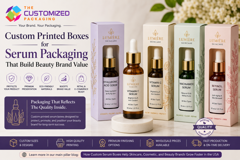
Custom Printed Boxes for Serum Packaging That Build Beauty Brand Value
Custom printed boxes for serum packaging help skincare, cosmetic, and beauty brands build stronger product value through premium presentation, logo branding, and professional packaging design. With custom printed serum boxes, serum boxes with logo, luxury finishes, eco-friendly materials, and wholesale custom boxes, brands can protect delicate serum bottles, improve retail shelf appeal, strengthen ecommerce visuals, and create a more trustworthy beauty brand experience.
 Published June 03, 2026
Updated June 03, 2026
17 min read
Published June 03, 2026
Updated June 03, 2026
17 min read
Serum products are one of the most trusted and high-value items in the skincare and beauty market. Customers buy serums because they want visible skincare support, targeted benefits, and a product that feels professional. Whether the serum is designed for hydration, glow, brightening, anti-aging, dark spots, acne care, fine lines, or skin repair, the packaging must create confidence before the customer even uses the product.
This is why custom printed boxes for serum packaging are so important for skincare, cosmetic, and beauty brands. A serum bottle may contain premium ingredients like vitamin C, hyaluronic acid, retinol, niacinamide, peptides, aloe vera, botanical extracts, or essential oils, but if the packaging looks plain or low quality, customers may not see the true value of the product. Professional custom printed serum boxes help brands present their products with a cleaner, stronger, and more premium image.
A well-designed serum box does more than hold the bottle. It protects delicate glass droppers, pump bottles, and cosmetic containers. It also displays the brand logo, product name, benefits, ingredients, directions, claims, and brand message. With the right custom boxes with logo, beauty brands can build stronger recognition, improve customer trust, and increase product value in retail and ecommerce markets.
At The Customized Packaging, we help skincare and cosmetic brands create custom boxes, custom packaging boxes, custom printed boxes, wholesale custom boxes, and bulk custom boxes that are built to protect, designed to impress, and made to help beauty brands grow.
Why Custom Printed Serum Boxes Matter
Custom printed serum boxes matter because packaging is often the first thing customers notice. Before they test the serum or read the full ingredients, they look at the box. The color, logo, typography, finish, and product information all create an immediate impression.
For skincare products, trust is extremely important. Customers apply serums directly to their skin, so they want the product to feel safe, clean, and reliable. A professionally printed serum box helps create that trust by making the product look organized, informative, and high quality.
Plain packaging may protect the bottle, but it does not create strong brand value. Custom printed boxes allow brands to present the product in a way that feels premium and memorable. The box can highlight product benefits such as hydration, brightening, anti-aging support, glow, skin repair, pore care, oil control, or sensitive skin support.
When customers see clear product information and attractive packaging, they are more likely to trust the brand and feel confident buying the serum.
Custom Printed Boxes Increase Beauty Brand Value
Brand value is not built only through the formula. It is built through the complete product experience. Packaging plays a major role in how customers see your skincare brand.
Custom printed boxes for serum packaging help increase brand value by making products look more professional, premium, and trustworthy. A serum in a generic box may look ordinary. The same serum inside a beautifully printed box can look more valuable and retail-ready.
Custom printing allows brands to create a strong identity through colors, design elements, logos, product claims, and packaging copy. For example, a vitamin C serum box can use bright orange, gold, or white tones to show radiance. A hyaluronic acid serum box can use blue, aqua, or clean white tones to show hydration. A retinol serum box can use navy, black, silver, or gold to show premium anti-aging care.
The right serum packaging boxes make the product feel aligned with its purpose. This improves perceived value and helps customers see your brand as more professional.
Custom Printed Serum Boxes with Logo Build Recognition
Logo branding is one of the most important parts of beauty packaging. Custom printed serum boxes with logo help customers remember your brand and recognize your products again.
Your logo can be printed on the front panel, top flap, side panel, back panel, inside box, product sleeve, or insert. For premium serum packaging, the logo can also be enhanced with foil stamping, embossing, debossing, spot UV, or metallic finishes.
Consistent logo placement helps your full skincare line look more organized. If your brand sells serums, creams, moisturizers, cleansers, toners, masks, face primers, or beauty products, your packaging should follow a connected design style. Consistent custom boxes with logo help customers identify your brand faster across different products.
For small skincare businesses and private label serum brands, logo packaging can make the product look more established. Customers may not know how large the company is, but professional packaging can make the brand feel more credible.
Custom Printing Makes Serum Packaging More Informative
Serum products usually need clear information because customers want to understand the formula before buying. They want to know what the serum does, which skin type it suits, what ingredients it contains, and how to use it properly.
Custom printed serum packaging boxes give brands enough space to include important details such as product name, serum type, main benefit, key ingredients, skin type, usage directions, warnings, net quantity, barcode, batch number, expiration or period-after-opening details, cruelty-free claims, vegan claims, website, QR code, and social media handles.
This information helps customers make better buying decisions. A customer looking for hydration can quickly identify a hyaluronic acid serum. A customer looking for glow can quickly understand a vitamin C serum. A customer looking for night care can recognize a retinol serum.
Clear packaging copy builds trust because it makes the brand look transparent and professional. In skincare, customers appreciate packaging that is both beautiful and useful.
Custom Printed Serum Boxes Improve Retail Shelf Appeal
Retail shelf appeal is very important for skincare and beauty products. In beauty stores, salons, spas, boutiques, and cosmetic counters, customers compare several products at once. Your serum packaging must catch attention quickly and explain the product clearly.
Custom printed serum boxes help products stand out on shelves with attractive colors, clean typography, strong branding, and clear product benefits. The front panel should show the brand logo, product name, serum type, and main skincare benefit. The side and back panels can include ingredients, directions, warnings, and company details.
A well-designed retail serum box can make the product easier to notice and easier to understand. Customers should quickly know whether the product is a vitamin C serum, hyaluronic acid serum, retinol serum, niacinamide serum, brightening serum, anti-aging serum, hydrating serum, or acne care serum.
Professional printed packaging boxes help your serum product look ready for retail display and improve the chance that customers will pick it up.
Custom Printed Serum Boxes Support Ecommerce Growth
Ecommerce beauty brands depend heavily on product photos, reviews, descriptions, and packaging presentation. Customers cannot physically test the serum before buying online, so the packaging must create trust through visuals.
A strong custom printed serum box improves product photography and makes your serum look more professional on Shopify, Amazon, Etsy, TikTok Shop, Instagram Shop, Walmart Marketplace, and your own website. Branded packaging also improves social media ads, influencer videos, unboxing content, and website banners.
When customers receive the product, packaging continues the experience. A printed serum box with clean branding makes the order feel more valuable and carefully prepared. This can encourage positive reviews, repeat purchases, and social media sharing.
For online skincare brands, custom packaging boxes are part of the customer journey. They help create trust before purchase and satisfaction after delivery.
Custom Printed Boxes Protect Serum Bottles
Serum bottles are often delicate. Many serums are packed in glass dropper bottles, pump bottles, or small cosmetic containers. These products can break, scratch, leak, or get damaged if the packaging is weak.
Strong serum packaging boxes protect the bottle during shipping, storage, retail handling, and customer delivery. The box should be made according to the correct bottle size so the serum does not move too much inside. For premium serum products, custom inserts can be added to keep the bottle more secure.
This is especially important for ecommerce brands shipping across the USA. If a serum arrives broken or leaking, the customer experience is damaged. That can lead to refunds, replacements, negative reviews, and loss of trust.
Durable custom boxes protect both the product and the reputation of your beauty brand.
Luxury Custom Printed Serum Boxes for Premium Beauty Products
Many serum products are positioned as premium skincare items. Customers often expect luxury packaging for anti-aging serums, retinol serums, peptide serums, brightening serums, vitamin C serums, and professional skincare formulas.
Luxury custom printed serum boxes can include premium cardstock, rigid boxes, foil stamping, embossing, debossing, spot UV, soft-touch coating, metallic finishes, window cut-outs, and custom inserts. These details make the product feel more expensive and giftable.
A luxury serum box can support higher pricing because the packaging matches the value of the product. When customers see premium packaging, they are more likely to believe the formula inside is high quality.
Luxury custom packaging boxes are also useful for influencer PR kits, skincare gift sets, limited-edition launches, beauty subscription boxes, and high-end retail displays.
Eco-Friendly Custom Printed Serum Boxes for Clean Beauty Brands
Sustainability is now important for many skincare customers. Clean beauty, vegan skincare, cruelty-free cosmetics, and natural beauty brands can build stronger trust with eco-friendly packaging.
Eco-friendly serum boxes and kraft serum boxes are great options for sustainable beauty brands. These boxes can be custom printed with logo branding, product details, recycling messages, botanical artwork, and clean design elements.
Eco-friendly packaging helps customers understand that your brand cares about responsible packaging. It also creates a natural and trustworthy look that works well for organic-inspired and plant-based serum products.
Sustainable custom printed boxes do not have to look basic. With elegant typography, soft colors, embossing, debossing, or subtle foil accents, eco-friendly serum packaging can still feel premium and attractive.
Wholesale Custom Printed Serum Boxes for Growing Brands
As skincare brands grow, packaging cost becomes more important. Ordering custom printed serum boxes wholesale can help reduce the cost per box while keeping packaging consistent and professional.
Wholesale custom boxes are useful for product launches, ecommerce restocks, retail orders, wholesale buyers, influencer PR kits, subscription boxes, and seasonal campaigns. When brands order bulk custom boxes, they can prepare for higher sales volume and maintain consistent branding.
Wholesale packaging also keeps your logo, box size, material, printing quality, colors, and finishing the same across different batches. This consistency makes your brand look more organized and reliable.
For USA beauty brands, custom boxes wholesale USA and custom boxes with logo wholesale are practical options for getting branded serum packaging at better pricing.
Affordable Custom Printed Serum Boxes for Small Beauty Brands
Small skincare and beauty businesses often need professional packaging while staying within budget. Affordable custom packaging boxes help startups and small brands create branded serum packaging without overspending.
Affordable packaging does not mean poor-quality packaging. It means choosing the right size, material, printing method, and finish for your budget. A simple cardstock serum box with clean logo printing can look professional and attractive. A kraft serum box can create an eco-friendly look at a reasonable cost.
Brands looking for cheap custom boxes should focus on value, not weak packaging. Low-quality boxes can damage products and reduce customer trust. A better option is cost-effective packaging that protects the serum and supports the brand image.
For startups, custom boxes no minimum or low minimum order options can help test packaging before ordering larger quantities.
Custom Printed Boxes for Vitamin C Serum Packaging
Vitamin C serums are popular for brightening, glow, antioxidant care, and uneven skin tone. Packaging for vitamin C serum should feel fresh, energetic, and radiant.
Custom printed vitamin C serum boxes can use orange, yellow, white, peach, or gold tones to communicate brightness and healthy-looking skin. The box can highlight benefits such as glow support, brightening care, antioxidant protection, and radiant skin.
The packaging should also include usage directions, ingredients, warnings, storage details, and product claims. Since vitamin C serums are often packed in glass bottles, protective custom serum packaging boxes are very important.
A bright and professional vitamin C serum box can help the product stand out in both retail and ecommerce markets.
Custom Printed Boxes for Hyaluronic Acid Serum Packaging
Hyaluronic acid serums are known for hydration, moisture, plump-looking skin, and smoothness. Packaging for this serum type should feel clean, fresh, and gentle.
Custom printed hyaluronic acid serum boxes can use blue, aqua, white, silver, or soft cream tones. Water-inspired graphics, smooth layouts, and clean typography can help communicate hydration benefits.
The box should clearly show the main benefit, suitable skin types, key ingredients, and usage directions. Professional custom printed serum boxes help hyaluronic acid products look credible and skincare-focused.
This packaging style works well for brands targeting dry skin, sensitive skin, daily hydration, and clean skincare routines.
Custom Printed Boxes for Retinol Serum Packaging
Retinol serums are often seen as premium skincare products. Customers buy them for anti-aging care, fine lines, skin texture, and nighttime routines. Packaging for retinol serum should feel professional, reliable, and luxurious.
Custom printed retinol serum boxes can use black, navy, gold, silver, purple, or deep blue tones. These colors help communicate advanced skincare and premium treatment.
Because retinol products often require clear usage instructions and warnings, packaging should provide enough space for helpful product information. The design should feel elegant but also practical.
Luxury custom serum boxes with logo can make retinol products look more premium and support higher price points.
Custom Printed Boxes for Niacinamide Serum Packaging
Niacinamide serums are popular for oil balance, pore care, smoother texture, and skin clarity. Packaging for niacinamide serum should feel clean, modern, and benefit-focused.
Custom printed niacinamide serum boxes can use white, green, blue, grey, or minimal clinical-style design. The packaging can highlight benefits such as oil control, pore care, balance, and smoother-looking skin.
A professional custom serum packaging box helps customers quickly understand the product and trust the brand. For ecommerce and retail brands, clear design and strong printing can increase buying confidence.
Best Materials for Custom Printed Serum Boxes
Material choice affects protection, appearance, and cost. The best material depends on your serum bottle type, product value, brand style, and selling channel.
Cardstock serum boxes are popular for standard skincare packaging. They are lightweight, printable, and cost-effective. They work well for dropper bottles, pump bottles, tubes, and small cosmetic containers.
Kraft serum boxes are ideal for vegan, cruelty-free, organic, and eco-friendly skincare brands. They create a natural and sustainable appearance.
Rigid serum boxes are best for luxury serums, gift sets, influencer PR kits, and premium skincare products. They provide strong protection and a high-end feel.
Corrugated packaging boxes are useful for ecommerce shipping, subscription boxes, and wholesale deliveries because they provide extra strength.
A professional custom box manufacturer can help choose the right material based on your serum size, bottle weight, budget, and brand image.
Best Printing and Finishing Options for Serum Packaging
Printing and finishing make serum boxes more attractive and premium. Popular printing options include digital printing, offset printing, CMYK printing, PMS color printing, and full-color printing.
Digital printing works well for small orders and startup packaging. Offset printing is better for larger wholesale custom boxes because it provides consistent quality. CMYK printing works well for colorful designs, while PMS printing helps match exact brand colors.
Finishing options include matte lamination, gloss coating, soft-touch coating, gold foiling, silver foiling, rose gold foiling, embossing, debossing, spot UV, window cut-outs, die-cut shapes, inside printing, and custom inserts.
A vitamin C serum may use gloss coating and bright colors. A retinol serum may use gold foil and soft-touch coating. A natural serum may use kraft paper with minimal finishing. The right finish should match your product and brand identity.
What to Print on Custom Printed Serum Boxes
A serum box should be attractive and informative. Customers should quickly understand the product, benefit, and usage.
Important details to print on custom serum packaging boxes include brand logo, product name, serum type, main benefit, skin type, active ingredients, formula claim, usage directions, warnings, net quantity, barcode, batch number, expiration or period-after-opening details, cruelty-free or vegan claims, website, QR code, and social media handles.
The front panel should focus on the logo, product name, and key benefit. The side and back panels can include ingredients, directions, warnings, and detailed product information.
A QR code can connect customers to skincare routines, serum application tips, product videos, ingredient details, reviews, or reorder pages. This makes your packaging more useful and interactive.
Custom Printed Serum Boxes for Private Label Brands
Private label skincare brands need packaging that makes their products look original and professional. Without custom packaging, private label serum products can look generic.
Custom printed serum boxes with logo help private label brands create a unique identity. The box can include your brand name, logo, product claims, ingredients, usage directions, formula benefits, and design style.
Even if the formula comes from a manufacturer, packaging makes the product belong to your brand. Professional custom boxes with logo can make private label serums look ready for ecommerce, retail, wholesale, influencer campaigns, salons, spas, and beauty boutiques.
For private label brands, packaging is one of the fastest ways to build beauty brand value.
How Custom Printed Serum Boxes Build Long-Term Brand Value
Custom printed boxes for serum packaging build long-term beauty brand value by improving product presentation, protecting delicate bottles, increasing perceived value, strengthening brand recognition, and creating a better customer experience.
For retail brands, printed serum boxes improve shelf appeal. For ecommerce brands, they improve product photography and unboxing. For private label brands, they create a unique identity. For luxury skincare brands, they support premium pricing. For sustainable brands, they communicate responsible values.
Packaging is not just a cost. It is part of how customers judge, remember, and trust your brand. A professional serum box can turn a simple product into a strong branded beauty experience.
Why Choose The Customized Packaging for Custom Printed Serum Boxes?
At The Customized Packaging, we help skincare, cosmetic, and beauty brands create high-quality custom printed serum boxes that protect products and build brand value. Whether you need packaging for vitamin C serums, hyaluronic acid serums, retinol serums, niacinamide serums, anti-aging serums, brightening serums, hydrating serums, vegan serums, or private label skincare products, we can create boxes according to your brand needs.
We offer custom boxes, custom packaging boxes, custom printed boxes, custom boxes with logo, printed packaging boxes, wholesale custom boxes, bulk custom boxes, and complete box packaging solutions for beauty brands.
As a professional custom box manufacturer and custom packaging supplier, we provide custom sizes, premium materials, logo printing, luxury finishes, kraft packaging, inserts, retail-ready boxes, ecommerce packaging, and wholesale pricing.
Whether you want to buy custom boxes, order custom boxes online, find a reliable packaging supplier, or get custom boxes wholesale USA, we can help you create serum packaging that supports your product, budget, and brand growth.
Final Thoughts
Custom printed boxes for serum packaging are one of the best ways to build beauty brand value. They help skincare brands protect serum bottles, improve presentation, increase customer trust, and make products look more premium in retail and ecommerce markets.
In the competitive beauty industry, customers notice packaging before they use the product. A professional printed serum box can make your product look more trustworthy, more memorable, and more valuable.
Whether you need custom printed serum boxes, serum boxes with logo, luxury serum packaging, eco-friendly serum boxes, wholesale custom boxes, or affordable custom packaging boxes, the right packaging can help your brand grow with confidence.
At The Customized Packaging, we create packaging that is built to protect, designed to impress, and made to build stronger beauty brand value.
For more detailed information, read our main pillar blog titled “How Custom Serum Boxes Help Skincare, Cosmetic, and Beauty Brands Grow Faster in the USA.”