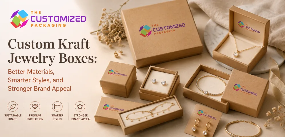
Custom Kraft Jewelry Boxes: How Kraft Material Shapes Jewelry Presentation
Kraft jewelry packaging is more than a brown box. Learn how natural, white and dark kraft surfaces affect printing, jewelry contrast, insert choices and the overall presentation of rings, earrings, necklaces, bracelets and other collections.
 Published June 29, 2026
Updated August 31, 2026
13 min read
Published June 29, 2026
Updated August 31, 2026
13 min read
Kraft packaging is often chosen for its natural brown appearance, but the material affects much more than the color of a jewelry box.
The surface tone changes how printed colors appear. The texture influences how a logo feels. Board construction affects whether the package feels light and simple or substantial and gift-ready. Even the relationship between the kraft exterior and the jewelry inside can change the way gold, silver, pearls and gemstones are perceived.
Well-designed custom kraft jewelry boxes therefore begin with a simple question: what role should the kraft material play in the presentation?
For some jewelry brands, it creates a warm handmade character. For others, kraft provides a restrained background that allows the jewelry to become the visual focus.
What Does “Kraft” Mean in Jewelry Packaging?
Kraft does not describe one single jewelry-box construction.
A lightweight folding jewelry carton can have a natural kraft surface. A substantial rigid box can use thick board wrapped in kraft paper. A drawer box may combine a kraft sleeve with a different inner tray, while ecommerce packaging may use kraft-faced corrugated board.
The visible surface can also vary considerably.
Natural brown kraft has the familiar warm paper tone and visible fibers. White kraft creates a lighter presentation and provides a different printing surface. Dark or black paper stocks can create a stronger contrast while retaining a paper-focused appearance.
This is why two boxes described as “kraft jewelry packaging” can look and feel completely different.
Natural Brown Kraft Creates a Warm, Understated Background
Natural brown kraft works particularly well when the jewelry or brand already has a handmade, botanical, rustic, minimalist or material-focused identity.
Its warm tone can complement hammered metals, wooden jewelry, natural stones, beads, handmade pieces and artisan collections.
The material also creates useful contrast with polished jewelry.
Silver can appear crisp against brown kraft. Gold creates a warmer tonal relationship. Pearls and pale gemstones can stand out strongly, particularly when the interior is designed to separate the jewelry visually from the exterior.
The important point is that natural kraft already has character before anything is printed on it.
Covering the entire surface with heavy graphics can remove the very quality that made the material attractive in the first place.
Printed Colors Behave Differently on Brown Kraft
Artwork should not be evaluated on a white computer screen and assumed to look identical on natural kraft.
Brown paper becomes part of the printed color.
Light shades may become muted. Some colors appear warmer or darker. Fine gradients and pale illustrations may lose contrast, while strong black, dark green, burgundy, navy and other deeper tones can remain visually effective.
This makes printed kraft jewelry boxes particularly suitable for artwork that is designed around the substrate instead of attempting to hide it.
A physical print sample is especially useful when accurate brand colors are important.
White Ink Changes the Design Possibilities
White ink can create contrast on natural or dark paper surfaces and can also be used beneath selected colors when a brighter appearance is required.
It does not, however, turn brown kraft into ordinary white paper.
The relationship between the printed artwork and the natural surface remains part of the final result.
For minimalist jewelry packaging, a small white logo or restrained line illustration can provide enough branding without covering the material.
White Kraft Creates a Cleaner Visual Direction
Not every brand that wants paper-based kraft packaging wants a brown exterior.
White kraft or suitable white paperboard can create a lighter, more contemporary appearance while still supporting the understated character associated with paper packaging.
It can work particularly well for bridal jewelry, pearls, delicate fashion jewelry and collections built around pale or pastel brand colors.
The lighter surface also gives printed artwork more predictable color reproduction than natural brown kraft.
| Surface Direction | Visual Character | Jewelry It Can Complement | Design Consideration |
|---|---|---|---|
| Natural brown kraft | Warm and tactile | Handmade jewelry, gold, silver, natural stones | Printed colors interact with brown substrate |
| White kraft | Clean and soft | Bridal jewelry, pearls, pastel collections | Handling marks may be more noticeable |
| Dark paper surface | Bold and contemporary | Gold, silver, bright stones, men's jewelry | Test folds and surface scuffing |
| Kraft-wrapped rigid board | Natural but substantial | Fine jewelry, gifting and statement pieces | Construction adds weight and storage volume |
| Smooth kraft surface | Refined and print-focused | Detailed branded collections | Less visible natural texture |
The right surface should support the jewelry rather than being selected because one version of kraft is assumed to suit every brand.
Dark Kraft Can Create Strong Contrast
Dark or black paper surfaces create a very different experience from natural brown kraft.
Gold, silver, pearls and brightly colored stones can stand out dramatically against a darker exterior.
White printing, metallic foil and restrained embossed or debossed details can also become more noticeable on a dark surface.
However, dark papers should be physically tested.
Some materials can show scuffs more clearly than natural kraft, and folded edges may reveal changes in tone depending on the board and construction.
For a premium jewelry collection, these details can matter as much as the artwork.
The Exterior and Interior Should Work Together
The kraft surface is only half of the presentation.
When the box opens, the customer sees the relationship between the exterior, interior and jewelry.
A natural brown exterior paired with cream can feel warm and soft. Brown kraft with black can feel more contemporary. A white exterior with a muted interior can work well for bridal collections, while dark packaging with a lighter insert creates stronger contrast around polished metals.
The jewelry itself should guide the decision.
A black insert may make silver jewelry highly visible but offer less contrast for a dark watch strap or black gemstone. A cream interior can complement gold but may not provide enough separation for certain pale stones.
The box should be evaluated with the actual jewelry inside it.
Kraft Packaging Should Not Make Small Jewelry Disappear
Rings, earrings and delicate pendants occupy very little physical space.
That makes proportion especially important.
A large kraft box with an oversized interior can make a small piece appear insignificant. A well-proportioned presentation creates enough empty space to frame the jewelry without allowing the package to dominate it.
The same principle applies across different jewelry types.
A ring may only need a compact presentation area, while a necklace requires more surface space to control its chain. Bracelets and watches need dimensions that respect their natural shape.
The kraft material may create the visual character, but the product should still determine the proportions.
Ring Packaging Needs Clearance Above the Setting
A kraft ring box should be developed around more than the diameter of the band.
Raised stones, decorative settings and unusual profiles require enough space above the insert so the jewelry does not touch the lid when the box closes.
The ring should also remain upright rather than leaning inside the slot.
For natural kraft packaging, a contrasting ring holder can help visually separate the product from the box and direct attention toward the setting.
The result should feel like the box was developed around that ring rather than around a generic cavity.
Earrings Need Alignment and Background Contrast
Earrings are viewed as a pair, so even small positioning differences become noticeable.
The display surface should keep both pieces at the same height and maintain consistent spacing.
For drop earrings, there also needs to be enough vertical room for the complete design to hang without overlapping.
Kraft can create an attractive background for earrings, particularly when the insert or card provides enough contrast with the metal and stones.
A natural paper card may suit handmade pieces, while a contrasting insert may work better for highly polished or fine jewelry.
Necklaces Need Space Without Visible Chain Clutter
A necklace requires more surface area than most small jewelry products, but simply making the box larger does not solve the presentation.
The pendant or central feature should remain the visual focus.
The remaining chain can be directed behind the display surface or into a concealed area so it does not gather around the centerpiece.
A kraft background can work particularly well with botanical, artisan or understated jewelry collections, but the chain should remain clearly visible against the chosen interior tone.
Bracelets Need a Presentation That Respects Their Shape
Different bracelet constructions require different layouts.
Fine chains can sit horizontally or follow a gentle curve. Bangles and cuffs may look better when their circular form remains visible. Charm bracelets need enough space to prevent decorative elements from overlapping.
For kraft packaging, the interior structure can remain relatively simple as long as it holds the bracelet in the intended position.
The visual warmth of the material should support the product rather than replacing proper product control.
Kraft-Wrapped Rigid Boxes Create a Different Product Tier
Natural-looking packaging does not have to feel lightweight.
A thicker rigid structure wrapped with kraft paper combines the tactile appearance of kraft with a more substantial box.
This can work well for fine jewelry, bridal pieces, watches, meaningful gifts or signature collections where a simple folding carton would not provide the intended presentation.
The difference is structural rather than purely decorative.
A rigid kraft box feels heavier in the hand, maintains its shape and can create a more deliberate opening experience.
That added construction should match the value and positioning of the jewelry rather than being used automatically for every product.
Minimal Branding Often Works Better on Kraft
One of kraft's strengths is that the material itself provides visual texture.
This means the packaging may not need large areas of printing to feel designed.
A carefully positioned logo, simple typography, one-color artwork, foil detail or subtle debossed mark can create a recognizable package while allowing the paper surface to remain visible.
For small jewelry boxes, this restraint becomes even more important because the available surface area is limited.
The logo should establish the brand without becoming visually larger than the jewelry experience it supports.
Foil and Texture Can Create Contrast Without Heavy Printing
Metallic foil naturally connects with jewelry because both materials react to light.
Gold, silver, copper and other foil accents can therefore work effectively on kraft surfaces when used selectively.
Embossing and debossing provide another option by creating physical depth rather than relying entirely on printed color.
The surface texture of the selected kraft stock affects how clearly these details reproduce, so the final material should be tested rather than assuming every paper behaves the same way.
A small, clean finish is often more effective than combining several decorative processes on the same package.
Kraft Does Not Automatically Mean Sustainable Packaging
The natural brown appearance of kraft can suggest environmental simplicity, but appearance alone does not establish the environmental characteristics of a finished jewelry box.
A package may also contain foam, velvet, magnets, plastic windows, synthetic ribbons, coatings, adhesives or laminated surfaces.
These components influence how the complete package can be separated, reused or recycled.
Brands making environmental claims should therefore consider the complete construction and verify relevant material information rather than assuming that a brown kraft exterior provides the full answer.
A simpler structure with compatible paper-based components may be appropriate when reducing material complexity is an important design goal.
Choose the Material Around the Brand Position
Kraft packaging can serve several different jewelry markets when it is used deliberately.
A handmade jewelry brand might emphasize visible fibers and understated printing. A bridal brand may prefer a cleaner white surface with a soft interior. A contemporary jewelry collection might pair dark paper with metallic branding, while a higher-value collection can use a rigid kraft-wrapped structure to create more substance.
The material does not determine the brand position by itself.
Its surface, structure, interior and artwork work together to create that impression.
Test the Complete Box, Not Just the Artwork
A digital rendering can show proportions and approximate colors, but it cannot fully demonstrate the texture of kraft, print absorption, foil reflection, fold behavior or the contrast between the packaging and the actual jewelry.
A physical sample allows the complete presentation to be evaluated.
Check the printed color on the selected material, the visibility of the logo, the fit of the jewelry, lid clearance, insert stability and how the package looks when opened.
It is also worth handling the sample repeatedly to see whether the surface scuffs, corners soften or printed areas change in appearance.
These observations are especially important when kraft texture is a major part of the brand presentation.
Frequently Asked Questions About Kraft Jewelry Boxes
Are kraft jewelry boxes always brown?
No. Natural brown kraft is common, but jewelry packaging can also use white kraft, darker paper stocks, smooth kraft surfaces or rigid boxes wrapped in kraft paper.
Does printing look different on natural kraft?
Yes. The brown substrate influences printed colors, particularly lighter shades and detailed artwork. Physical proofs are useful when color reproduction is important.
Can kraft jewelry boxes look premium?
Yes. Material thickness, structure, proportion, inserts, printing and finishing determine the final presentation. Kraft-wrapped rigid structures can create a more substantial experience while retaining a natural paper surface.
What jewelry works well with kraft packaging?
Kraft can be adapted for rings, earrings, necklaces, bracelets, watches and jewelry sets. The box dimensions and interior support should be developed around the actual piece.
What colors work well with natural kraft jewelry boxes?
Black, white, dark green, burgundy, navy and metallic details can create strong contrast on natural brown kraft. The best combination depends on the jewelry, brand colors and selected paper stock.
Is kraft jewelry packaging recyclable?
That depends on the complete construction rather than the exterior appearance alone. Inserts, coatings, magnets, films, adhesives and decorative components can affect how a package should be handled at end of life.
Should kraft jewelry packaging be sampled before production?
Yes. A physical sample helps confirm product fit, material texture, printed color, finishing quality, interior contrast and how the box performs during opening and handling.
Let the Material Support the Jewelry
The strength of custom kraft jewelry boxes comes from the relationship between the material and the product inside.
Natural brown kraft can create warmth and texture. White surfaces can provide a cleaner presentation. Dark papers can strengthen contrast, while rigid kraft-wrapped structures can add substance for higher-value pieces.
The best result is not necessarily the box with the most printing, the thickest board or the largest number of finishes.
It is the package where the kraft surface, jewelry, interior, structure and branding feel like parts of the same design.
The Customized Packaging develops custom kraft jewelry boxes around your jewelry dimensions, preferred kraft surface, branding and presentation requirements. Share your product specifications and artwork to create packaging designed around both the jewelry and the material.